Coach Foundation
This is the page description.
ABOUT
May 2023
Visual Identity
Branding + Identity
Client: Coach
CD: Veronica Corzo-Duchardt
ACD: Sarah Hallacher
Lead Designer: George Nichols IV
Coach foundation
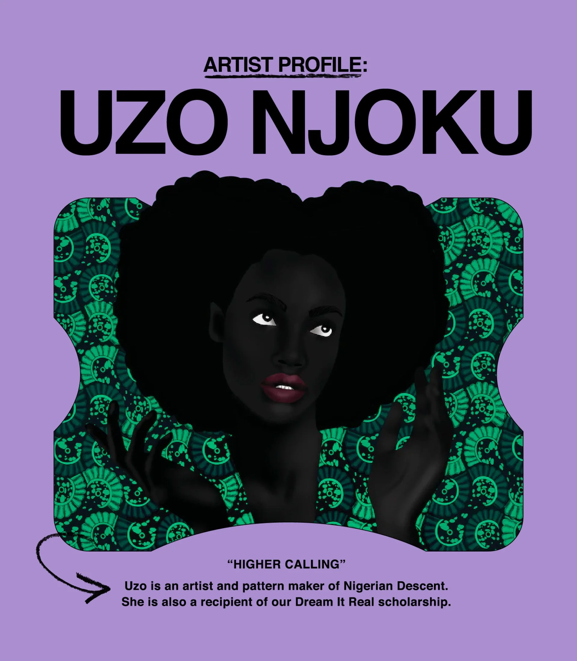
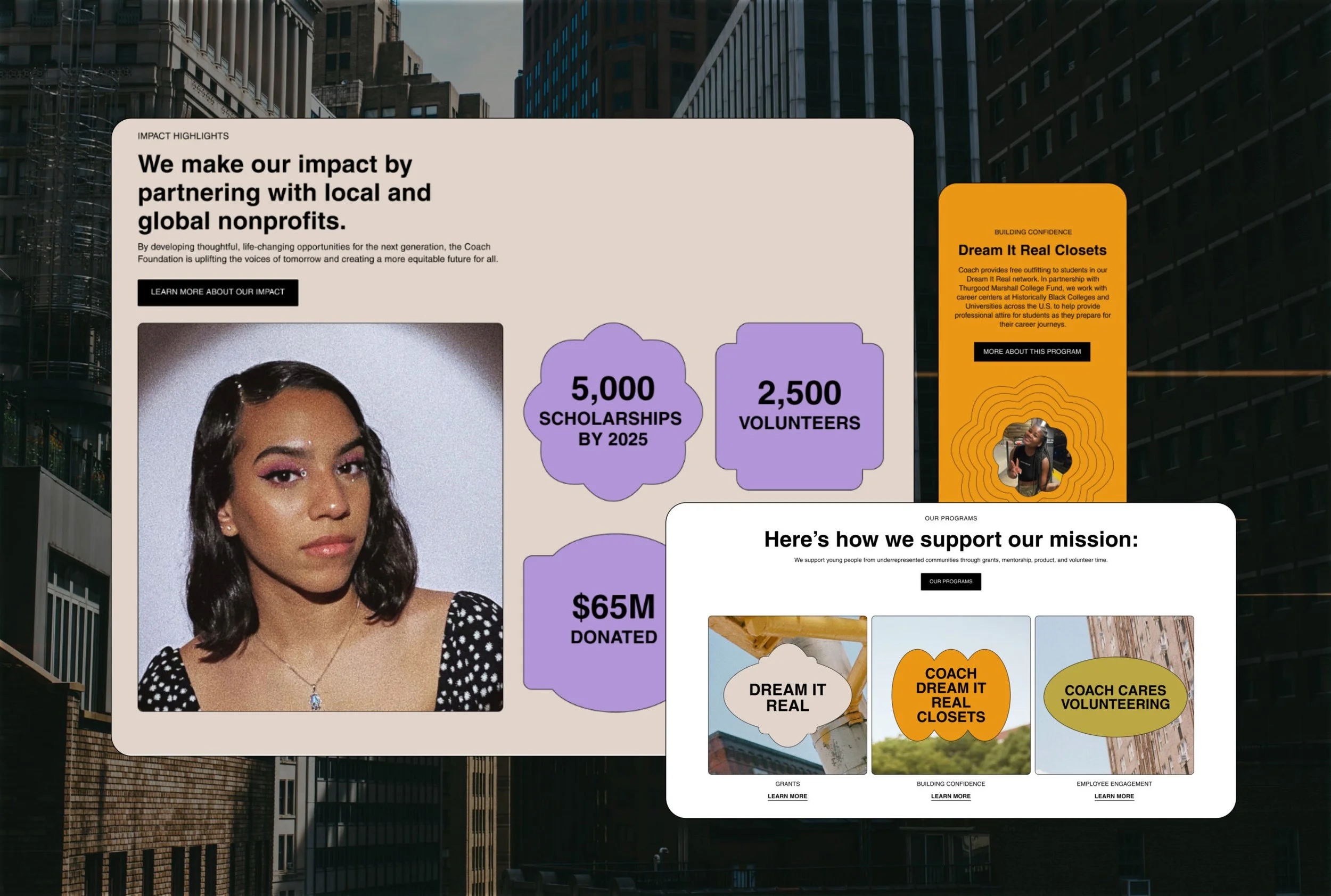
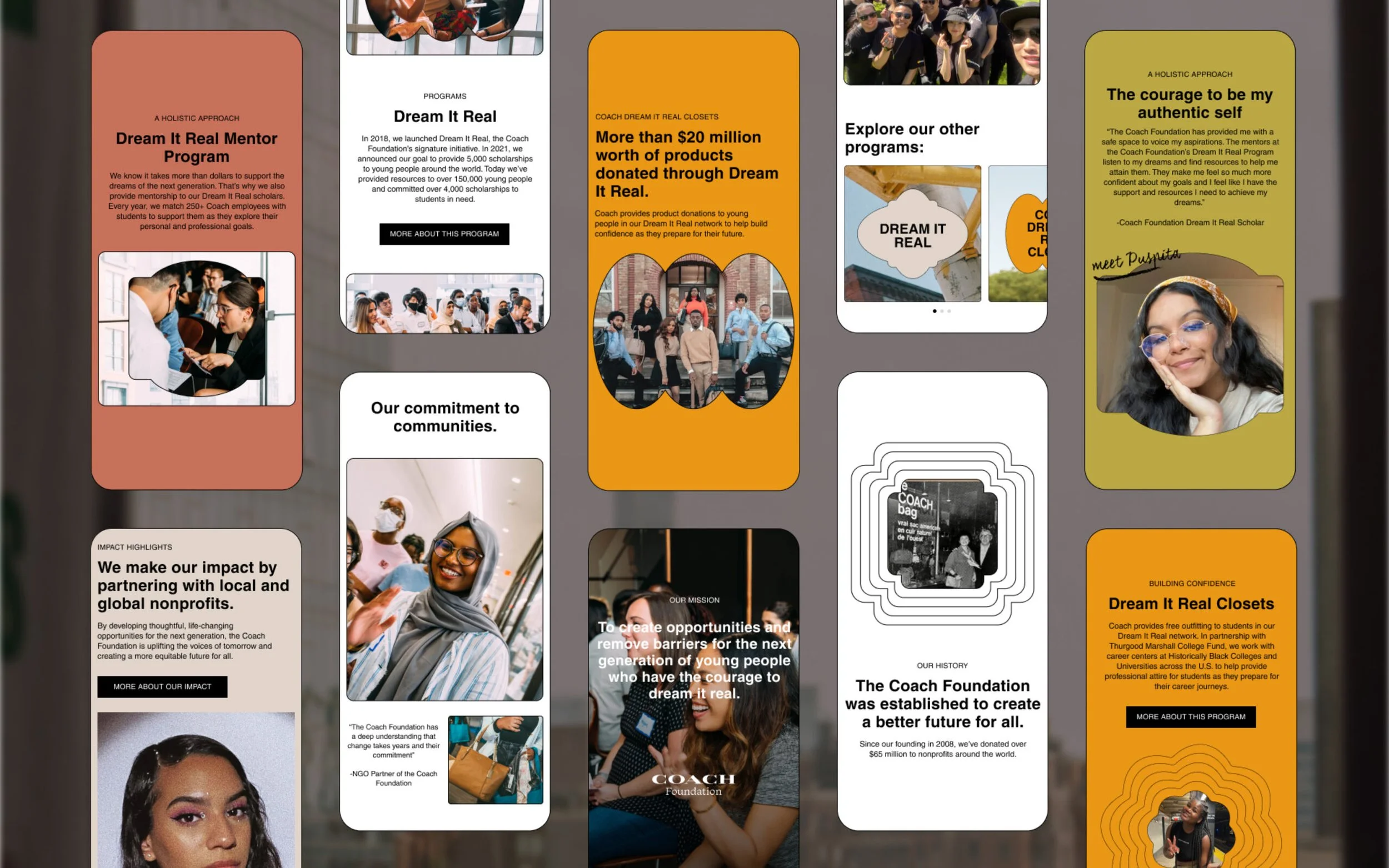
The Coach Foundation, backed by the iconic New York City fashion house, charged Ghost Note with the task of creating a bold, bright, gritty brand to match the authentic creativity of the young people they serve. Under the supervision of leadership at Ghost Note I developed a Flexible system that uplifts historically underrepresented youth through continually developing new ways to support and inspire their studies, passions, and limitless futures.
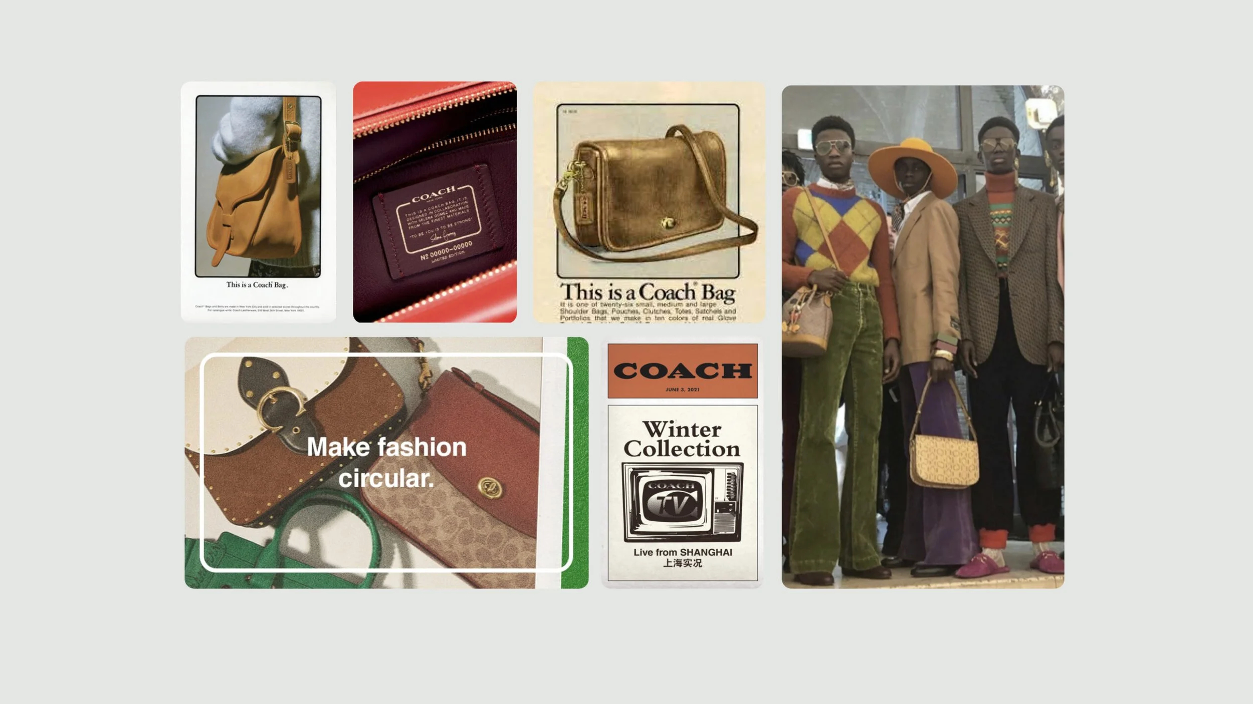
Creating a sub-brand for a fashion giant presented a unique opportunity to celebrate their legacy while inviting in space for the next generation, who is served by the Foundation. The challenge was to incorporate key visual components of the existing Coach brand and flex for different audiences—from Gen Z on Instagram to Boomers on Non-Profit Boards— resulting in visuals that have range from simple to complex
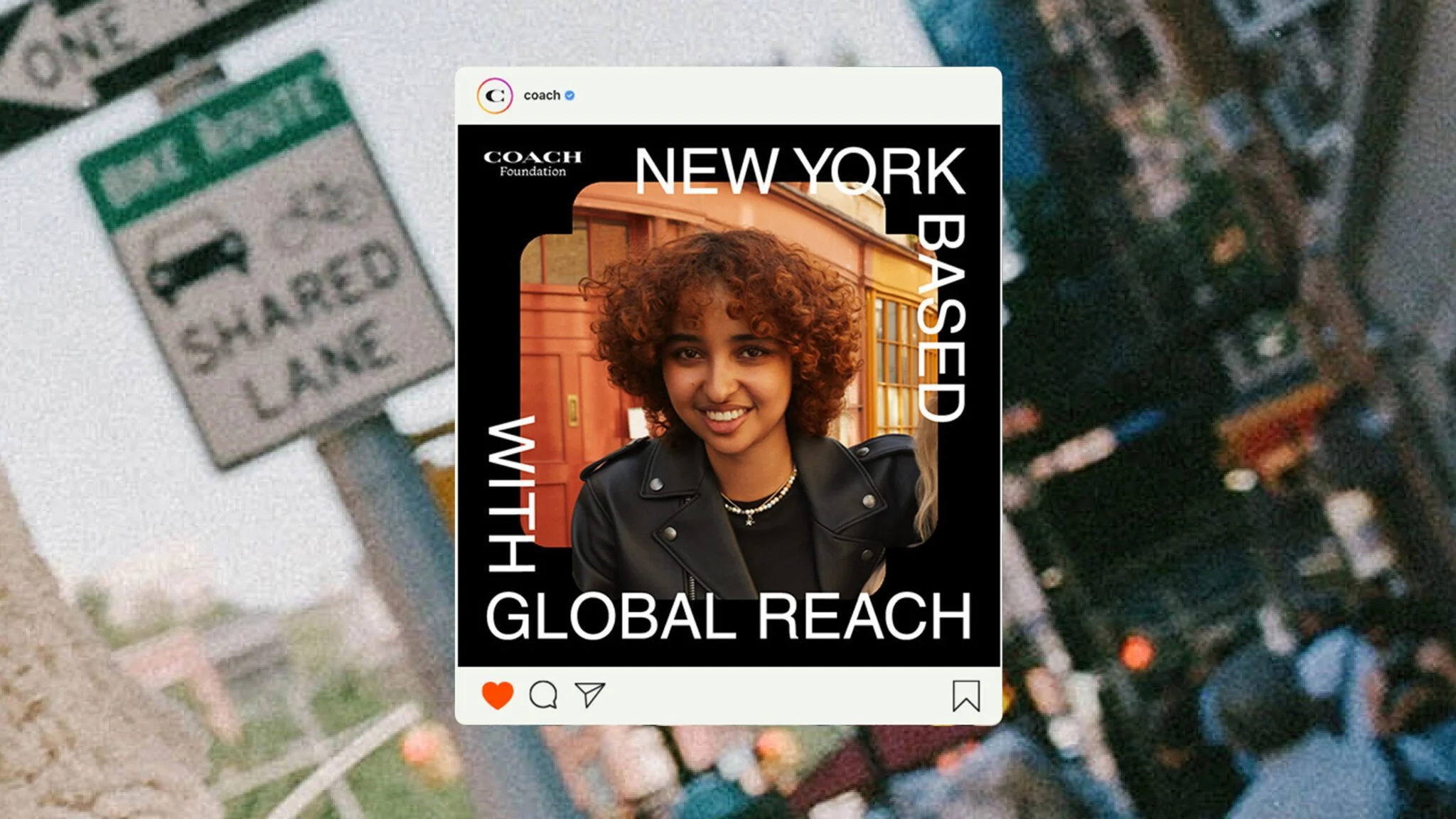
Visual Layering system + Social Template
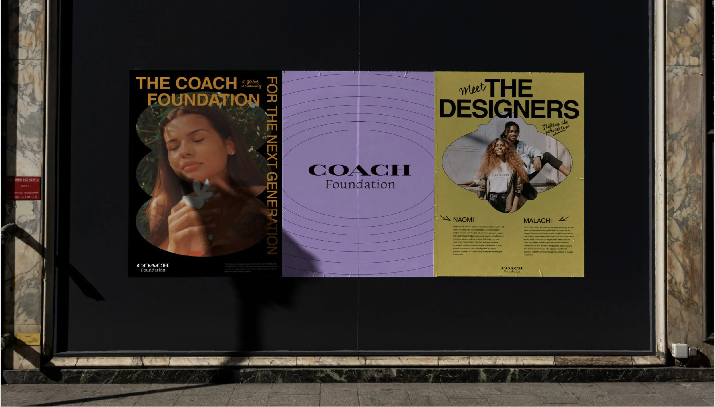
Working within tight constraints under the greater Coach brand pushed us to get creative in using systems already in place. Taking reference directly Coach’s rich creative history we devised a system of simple typography, framing devices and color palettes derived from Coach’s visual archives.
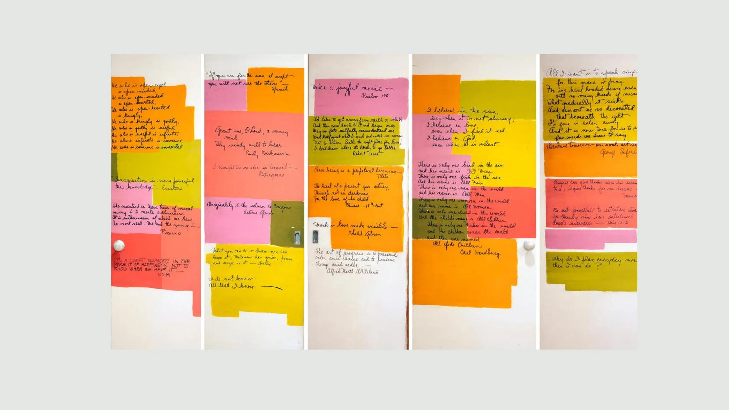
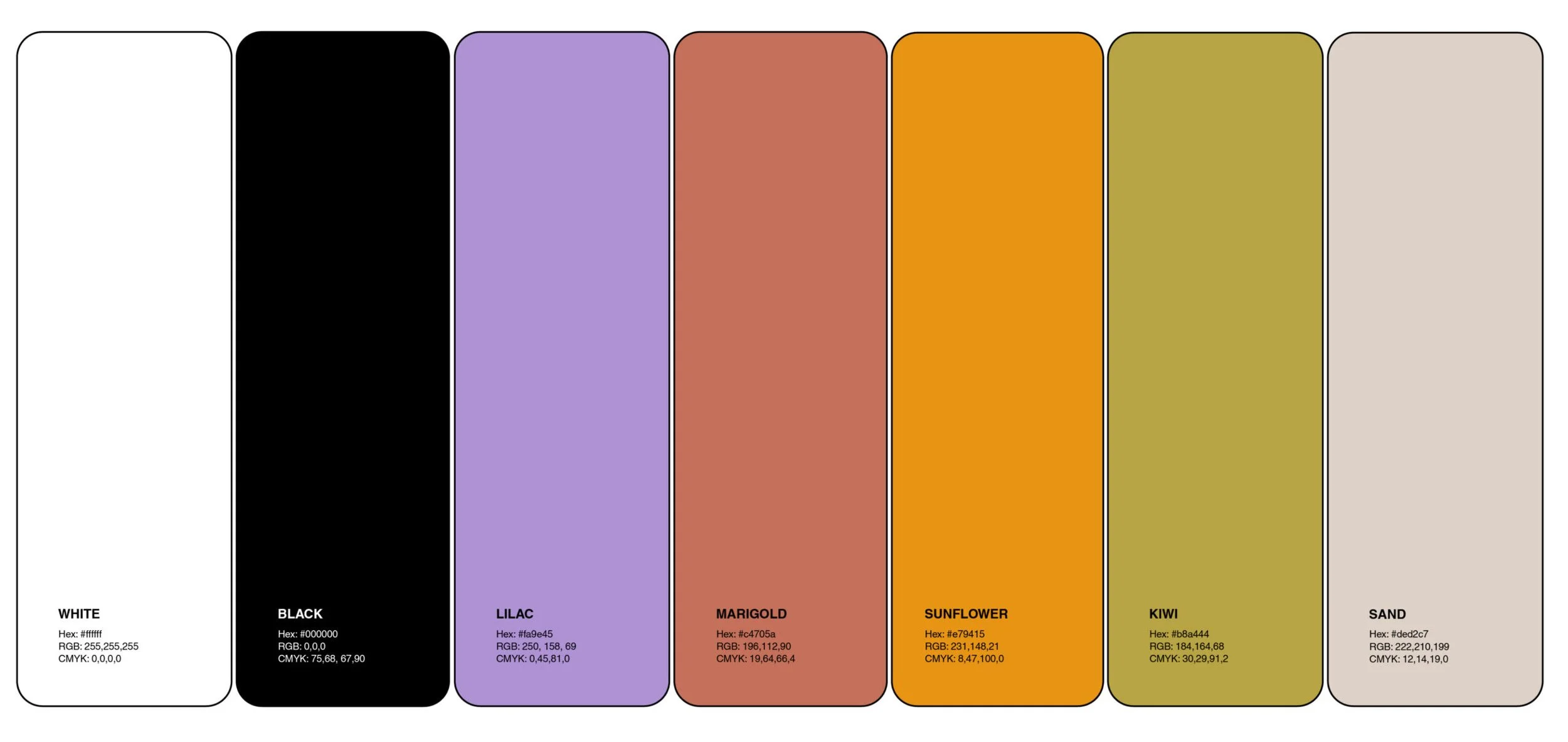
Referencing an image of paint swatches and handwritten notes from the apartment wall of Bonnie Cashin, Coach’s first Creative Director, we created a warm and approachable palette that balances vintage with modern. The palette is based in black and white, and uses accent colors and vibrant photography to bring color to the brand. We imagine a limited palette of modern neutrals paired with a few brighter tones used selectively as accents.

The Coach Foundation’s voice carries through many different rooms. We needed a system that was fluid enough to speak effectively from corporate board rooms to Gen Z. We focused on forms that shift perspective, enhance focus and accentuate the art it encapsulates. This visual language highlights Gen Z as a focal point to be admired— a dynamic system that flexes to best fit each unique subject.
The Coach “C” and Story Patch are iconic and widely-recognizable marks in the Coach brand. Using the shape of these elements in various combinations and configurations, we generated a series of unique shapes that can be used as graphic assets, accents, or photography masks.